On the 27th of October 2016, I went to Tokyo, Japan for two weeks with my boyfriend, Danny.
The trip was, for failure of a better word, incredible. Tokyo was so surprisingly diverse and the ‘kawaii’ influence was inescapable.
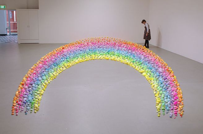
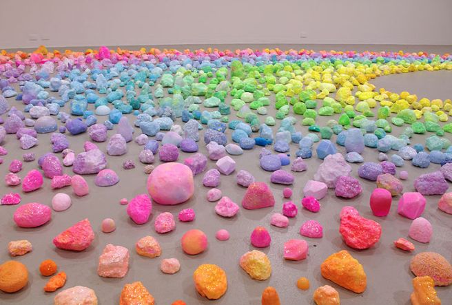
Japan have truly embraced all things cute, quirky and colourful, and I was definitely okay with that.
First, food.
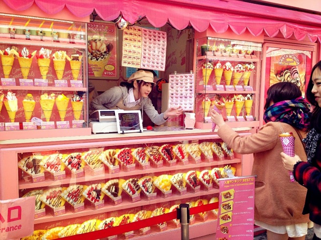
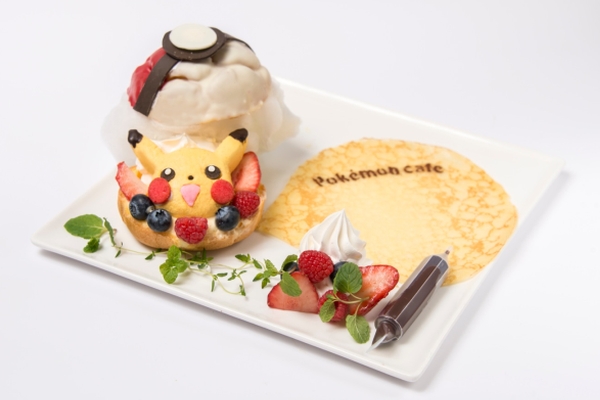
Cute, novelty food was everywhere. And I mean everywhere.
Tokyo was a place where Halloween meant scary donuts and glow in the dark ice cream.


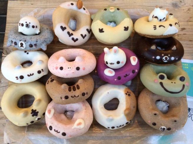
But also a place where even the everyday donuts came in more interesting shapes and sizes than here in Preston. From round and bobbly to adorably bite size.


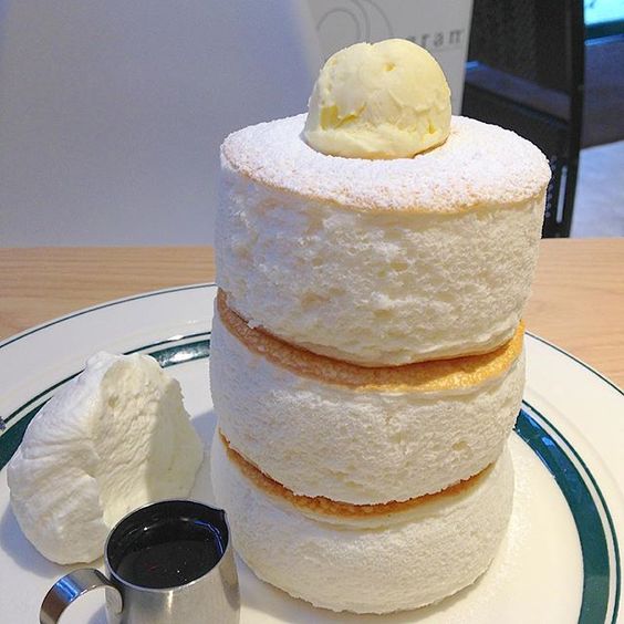
Tokyo was a place with pancakes so big and so fluffy that they wobbled. Yes. They actually wobbled – like jelly!


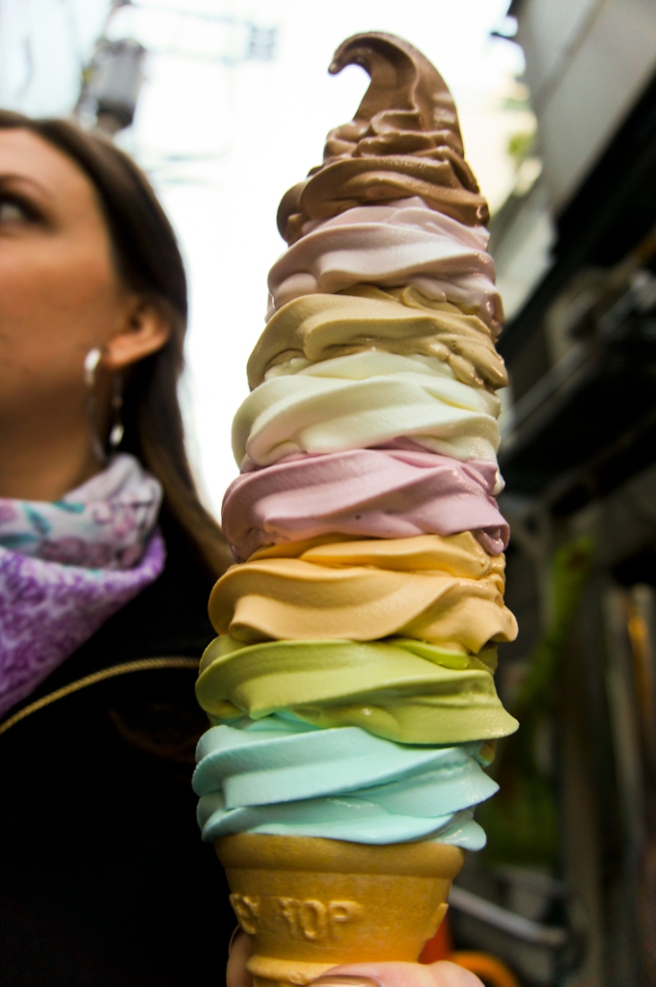
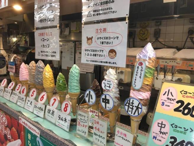
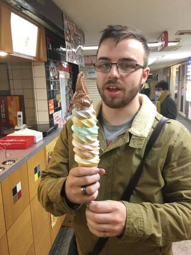
It was a place where you could buy an 8 flavour, 1.2kg ice cream cone for less than £3
(Yes, we each bought one. And yes, we each finished the whole thing — no regrets!)
A place where ice cream sundae rabbits are lovingly prepared by maids. They then perform a dance for you in full maid costume whilst you sit there and awkwardly cheer them on with a tambourine, wearing rabbit ears. Yes, that happened.


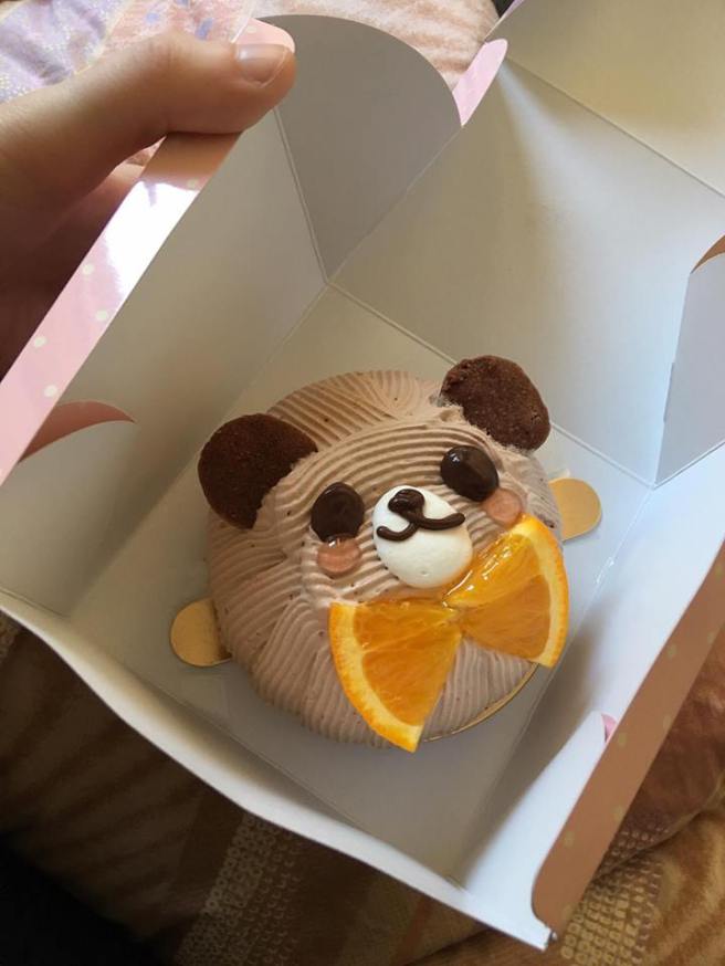
And even the subway station sells teddy bear cakes.
So cute!
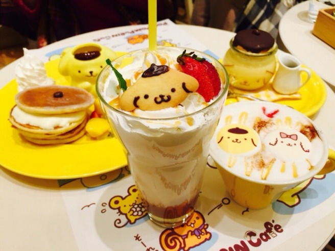
A place with adorable themed cafes. This was the PomPomPurin Cafe in Harajuku, themed entirely around a cartoon Labrador retriever and his animal friends.


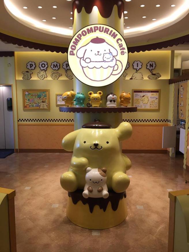
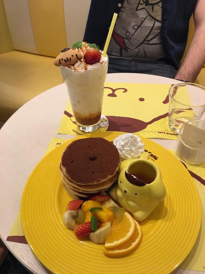 Delicious, too! (I ate way too many pancakes over the span of two weeks, but it was all in the name of research…)
Even McDonald’s were getting in on the action with a special themed McFlurry
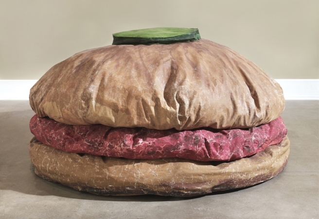
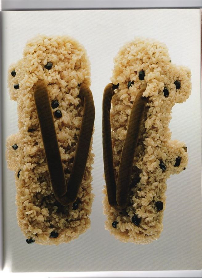
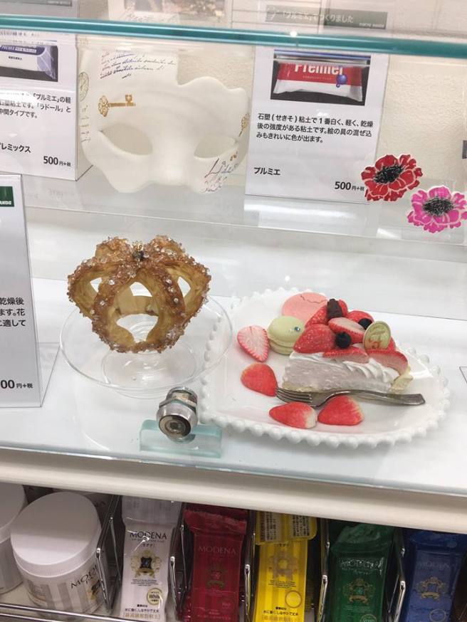
Tokyo was also a place were fake food was as prominent as the real deal.
Here is a cabinet from a popular craft, stationary and lifestyle store called ‘Tokyu Hands’.
Fake mousse-cake and a pastry tiara with sugar crystal diamonds – both fantastic inspirations for my project!
Tokyo has fabulous wall art like this around every corner.
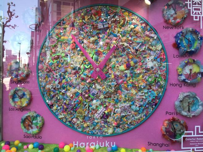
And even the clocks are as bonkers as you’d expect them to be.
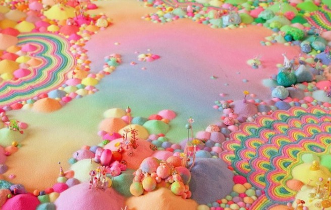
A place where sweets are part of your 5 a day. (well, maybe not)


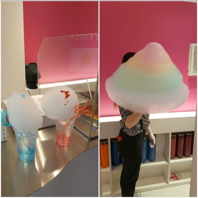
Just look at that Candy Floss!
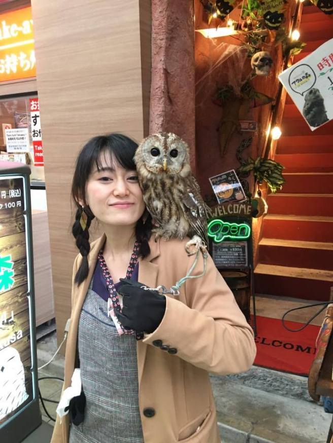
Tokyo is also a place with an unusual love for animal cafe’s. Yes, that is an owl.
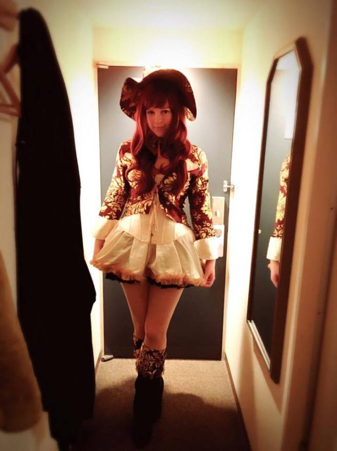
And of course, even I had to get in to the Halloween spirit in Tokyo – I would have stood out if I DIDN’T dress up!
3 days straight of a city full of costumes. It was amazing!
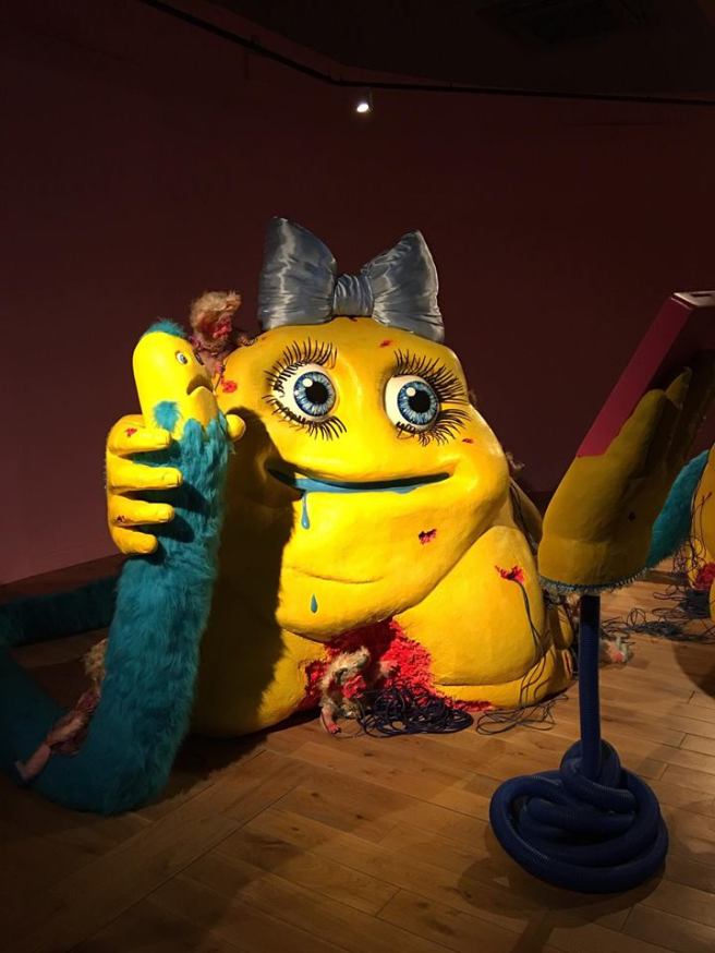
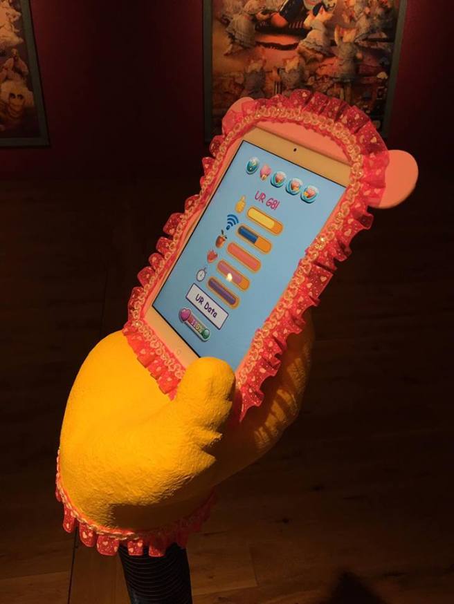
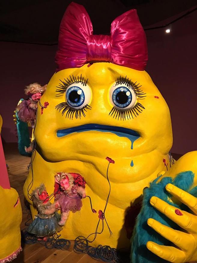
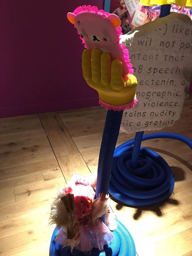
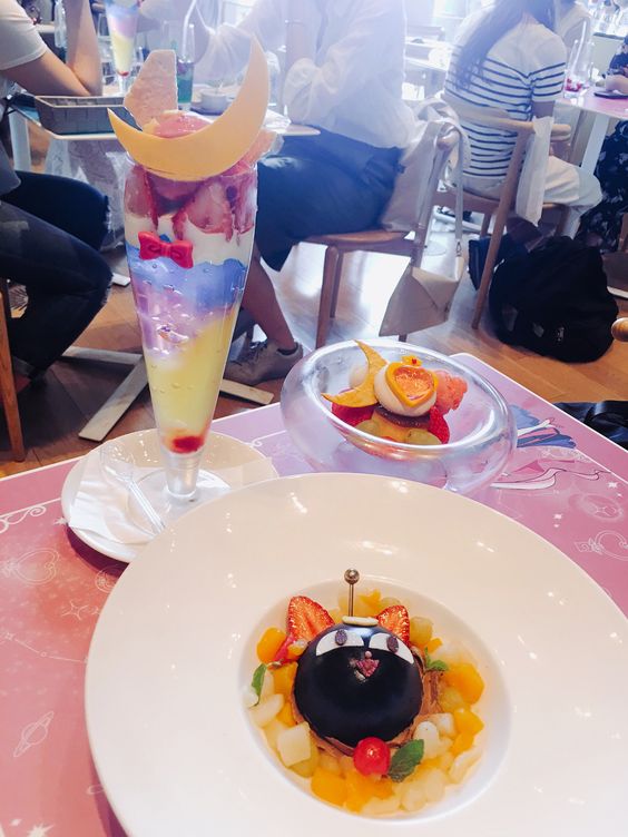
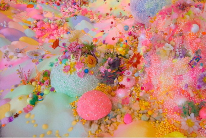
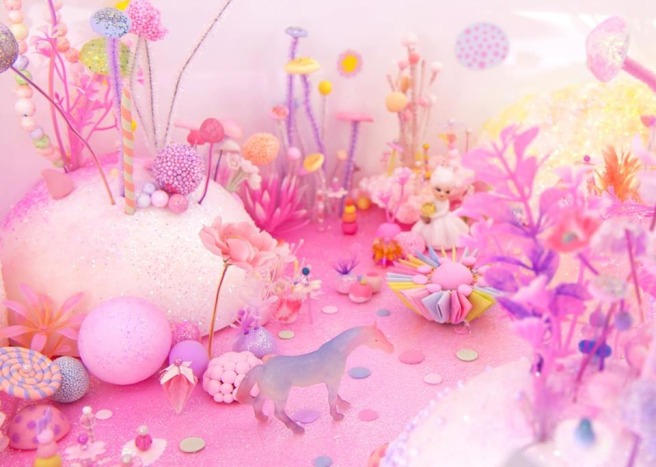
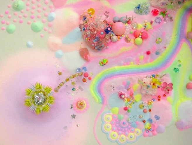
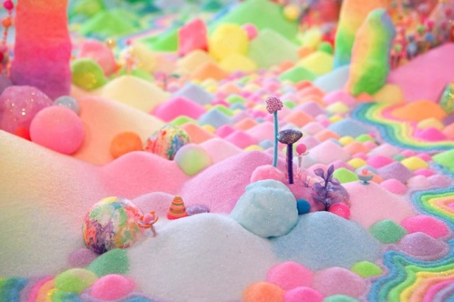
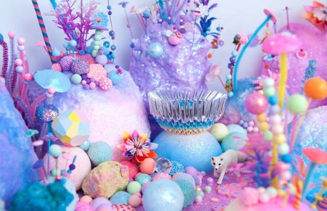
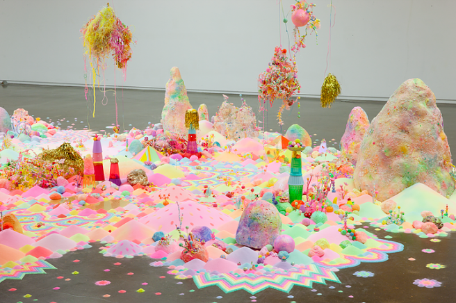
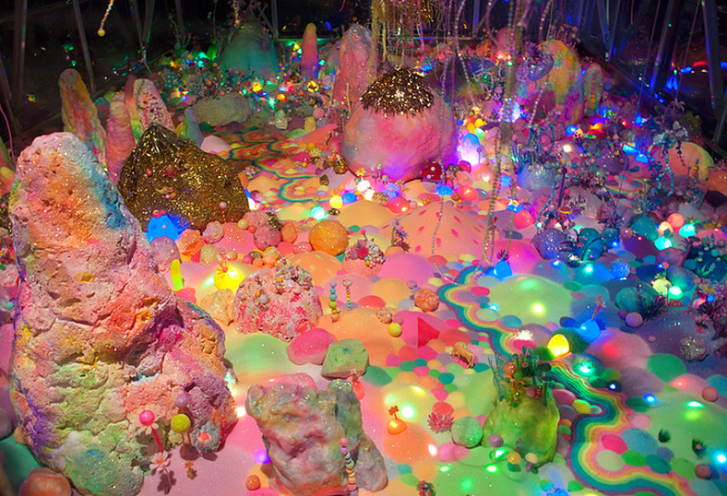
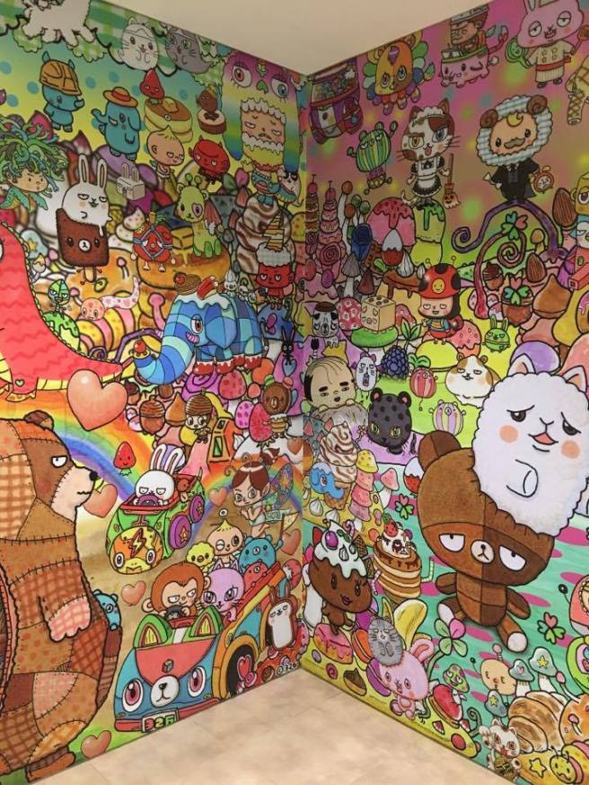
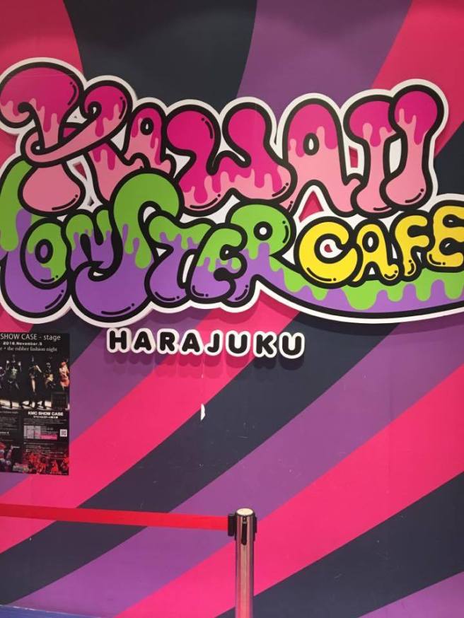
Tokyo is also home to the Kawaii Monster Cafe – an eccentric place of Candy colours and food dripping off the walls.
This place was honestly one of my favourite places in Tokyo – it was a work of art in itself.
I’m just disappointed I couldn’t get more photographs, but overall the lighting wasn’t great for taking photographs… I guess you just had to be there!


Yeah, even my food was themed like an artist palette, with rainbow pasta and coloured sauces!

Regular bread? Not even close. These are all lamps!


And these little guys?
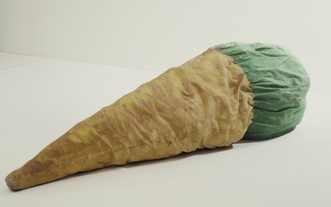
Carrot and radish… people. Just lying around in various poses. Why not!


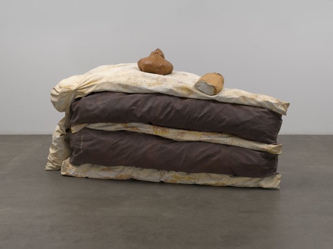
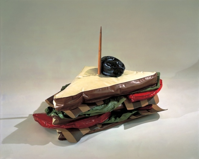
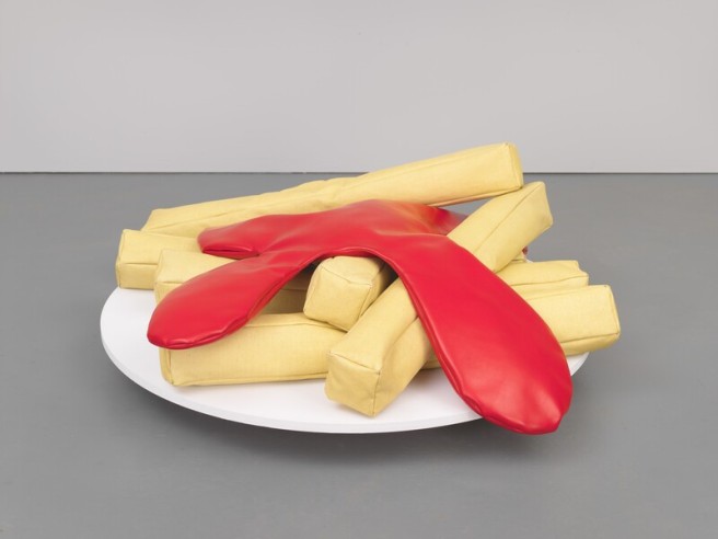
Even more scarily real looking fake food…


We always had time to stop, and eat more research.


And believe me, nobody could pull of novelty cute like Tokyo Disneyland and DisneySea!
Food, merchandise, even the trains were themed and Disneyfied but with that needed Japanese twist.